As an Amazon Associate, we earn from qualifying purchases. Some links on this site are affiliate links at no extra cost to you. Our recommendations are based on thorough research and editorial judgment.

Color-Coding Vs Text Labels: Which Organization Method Works Better
When it comes to organizing tasks, both color-coding and text labels have their perks. Color-coding adds flair, helping quick recognition. Text labels, however, deliver clarity and precision—think of them as your trusty map in a colorful theme park—without the risk of getting lost! Each method has strengths, but why not combine them? This combo can turbocharge organization! So, what fits your style better? Stay tuned to uncover more tips and tricks for organization mastery.
Key Takeaways
- Color-coding enhances intuitive categorization and quick information retrieval, improving task management efficiency.
- Text labels provide clear descriptions, enabling quick identification and minimizing search time for users.
- Combining both methods leverages visual hierarchy; colors attract attention while text conveys critical information.
- Over-reliance on color-coding can lead to confusion and cognitive overload, making text labels essential for clarity.
- Cultural and individual factors influence color perception, making text labels universally understandable in diverse settings.
Understanding Color-Coding in Organizational Systems
Color-coding in organizational systems, while seemingly simple, can dramatically change how people manage their tasks and information. By using specific colors, individuals can categorize items more intuitively. This taps into color psychology, where colors act as psychological triggers—cueing memory and recognition.
Effective systems rely on clear color meanings; everyone should know at a glance what each color represents.
Here are some quick tips to implement color-coding effectively:
- Use bright colors for urgent tasks (red, orange).
- Reserve calming colors (blue, green) for routine items.
- Consistency is key—keep your colors the same across different platforms!
For physical organization, acrylic magazine holders are available in clear, frosted, and various colors to match your color-coding system and enhance your workspace decor.
The Science of Visual Processing

Visual processing is an incredible feat of the human brain—so incredible, in fact, that it uses a whopping 30% to 40% of our cortical resources. This amazing capacity highlights how visual cognition operates as an independent system. It uses distinct neural mechanisms for interpreting our world, often without us even realizing it!
Conscious perception and unconscious processing work together, creating a seamless experience. Attention plays a critical role, enhancing important visual stimuli while leaving others in the background. Ever had a moment of “wait, what was that?”—thank visual masking!
Ultimately, this process helps with feature binding, allowing us to see a whole picture rather than just scattered parts. This is why modular designs in organizational systems leverage our natural visual processing abilities to create layouts that are both functional and aesthetically pleasing. Isn’t our brain astonishing?
Benefits of Color-Coding for Quick Recognition

In the domain of learning and information processing, a splash of color can make all the difference. Color-coding serves as fantastic visual cues. It speeds up information retrieval, too. When students see colors, they quickly make connections—think of colorful charts versus bland text!
Here are some shiny benefits of color-coding:
- Pattern Recognition: Distinct colors reveal trends and anomalies.
- Cognitive Efficiency: It simplifies complex data into neat categories.
- Engagement Strategies: Colors boost motivation in learning materials.
- User Navigation: An organized color scheme is like a GPS for your brain.
Color-coding with clear plastic containers allows you to see your supplies at a glance while maintaining visual organization through tinted or colored storage options.
Cognitive Load and Decision Making With Colors

Cognitive clarity can often feel elusive, especially when overwhelmed by choices. Think about it—too many colors can cause cognitive overload. Users might find themselves lost in a sea of hues! Effective color usage improves visual clarity and enhances decision accuracy. For instance, green backgrounds lead to faster response times and fewer errors. That’s great for quick thinking! However, clutter from excessive colors can thin attention spans and elongate decision-making times. Following solid design principles helps avoid confusion. Similarly, clear design enhances visibility in organizational systems, making it easier to locate items and reduce mental strain during decision-making. In conclusion:
- Use clear, focused colors.
- Match colors to the task.
- Avoid unnecessary complexity.
Reducing Errors Through Consistent Color Usage

Effective color usage can greatly enhance safety, especially in settings where quick decisions matter—like hospitals. Consistent color schemes are vital for error reduction. When medics can immediately recognize color-coded labels, critical information becomes clearer. For example, using prefilled syringes cut medication delivery time from 47 seconds to just 19 seconds!
To keep things safe, remember these tips:
- Stick to a simple, consistent color palette.
- Verify high contrast for better visibility.
- Avoid colors that confuse—like those pesky similar shades!
- Supplement colors with clear text labels.
Regular staff training reinforces understanding. Think of it as a fun refresher course, not another dull meeting! With these practices, everyone can benefit from color consistency, leading to safer healthcare environments. Similarly, transparent designs enhance visibility in organizational systems, allowing for quick identification and access to items when time-sensitive decisions are needed.
Enhancing Training Efficiency With Color-Coded Systems
Using color-coded systems can vastly improve training efficiency and make learning feel more engaging. Color effectiveness plays a key role. With brighter hues, learners can easily spot important info, so they study better. Imagine this— a student finding key notes quickly. It saves time and boosts confidence!
Here are some benefits of color coding in training:
- Faster Information Retrieval: Tasks become quicker and easier.
- Increased Retention: Remembering material improves—by 13-19%!
- Higher Engagement: Learners stay motivated when seeing colorful materials.
Just as color-coded containers with reusable labels help maintain organized pantries by preventing food items from getting mixed up, the same principle applies to organizing training materials for quick reference and clarity.
Recommended Products
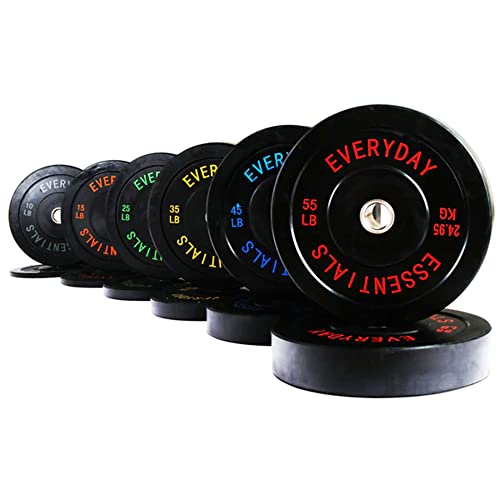
Complete Plate Set: Includes 12 Olympic bumper plates—pair of 10 lb., 15 lb., 25 lb., 35 lb., 45 lb., and 55 lb.—for progressive strength training, endurance building, and overall muscle development

Heavy-Duty Construction: Made with 1000D military-grade fabric and reinforced stitching to prevent leaks and ensure durability during intense workouts

Measures kWh and peak demand (optional)
Communication Improvement via Color Codes
Color can be a game changer in communication. It taps into color psychology, amplifying understanding in impressive ways. When information is color-coded, it grabs attention—much faster than plain old text labels. Here’s why that’s fantastic:
- Better focus: Color highlights important details quickly, saving search time.
- Improved memory: Bright colors help people remember what they learned, kind of like a mental highlighter.
- Faster pattern recognition: Colors make it easier to spot themes in complex data.
In visual storytelling, color turns information into something lively and engaging. Plus, using consistent colors across cultures can simplify communication. So, whether you’re presenting data or teaching a class, color-coded systems can seriously up your game—with less stress and more fun! For home organization, clear storage bins combine the benefits of color-coding with immediate visibility, allowing you to identify contents at a glance without opening containers.
Practical Applications of Color-Coding
While it might seem like a small change, incorporating color-coding into daily routines can lead to big improvements. It makes organizing tasks, meals, and even your craft supplies much easier.
- Home Organization: Use color dots for folders to categorize by project or urgency. Meal prep? Assign green for veggies and red for proteins—yum!
- Kids’ Learning: Color-code books and toys to enhance cleanup and educational fun.
- Workplace Efficiency: A simple color-coded system streamlines inventory and boosts productivity—everyone loves fewer mix-ups!
- Digital Tools: Flashcards and bullet journals with color cues help with studying.
- Beauty and Makeup Storage: Color-coded organizers in stylish options like blue or white help reduce clutter while maintaining a chic aesthetic in your beauty area.
Color psychology can even spark motivation. So, grab your favorite colors and immerse yourself in these organizational tools! Your cluttered life will thank you—promise!
Recommended Products

Heavy-Duty Construction: Made from 430 stainless steel with an anti-fingerprint finish, this 72-inch tool bench ensures durability and easy maintenance, perfect for busy garages and workshops.

45 unit mobile charging station: This 120V mobile charging cart contains 45 internal NEMA 5-15R outlets to proved up to 1, 440 total Watts for Chromebook charging, iPad charging, other tablet charging, or laptop charging. An in-cabinet RJ45 jack connects Ethernet peripherals including routers and hotspots. 10 ft. Cord allows for flexibility When accessing AC outlets.

Secure Key Box Organizer: BARSKA Quick Access Key Cabinet Digital Wall Safe can hold 736 (Maximum: 756 keys) keys on numbered hooks and comes with colored key tags. Our key cabinet is designed to be spacious, well-constructed, and convenient for securely storing your keys
Psychological Impact of Colors on User Experience
Colors play an often-overlooked role in user experience, affecting how people interact with digital spaces. Color psychology influences emotional response, creating visual hierarchies that impact usability. For instance, blue fosters user trust and calmness. Red, on the other hand, ignites urgency — think of that “buy now” button! Vibrant yellows scream happiness, though they can be hard to read.
Also, remember that colors carry cultural influences. What feels cozy to one may seem alarming to another. Designers must think about these factors, avoiding cognitive biases like jumping to conclusions based on color alone. Each choice shapes brand identity and enhances design aesthetics, engaging users on multiple sensory levels. Similarly, customizable labeling in physical organization systems helps with quick identification and reduces the cognitive load of searching through items. Color isn’t just pretty; it’s pivotal! So, choose wisely!
The Role of Text Labels in Organization
The role of text labels in organization is undeniably significant for creating a well-ordered environment. Text labels are essential—this is where their importance truly shines! They help users quickly identify items without searching for ages. Imagine spending less time looking for that elusive stapler!
Here are some effective labeling strategies:
- Use clear descriptions, like “office supplies” instead of just “supplies.”
- Include details such as expiration dates or instructions, making everyone’s life easier.
- Opt for universally understood terms to avoid miscommunication.
With text labels, the organization becomes simpler. They keep spaces tidy and reduce the stress of misplaced items. For collections like tea bags, labels work alongside features such as transparent lids or windows to enhance quick identification of different varieties. Overall, text labels create a welcoming environment that everyone can navigate—who doesn’t love a little clarity in life?
Limitations of Color-Coding Alone
Text labels provide clear communication in organizational systems, but sometimes, folks lean too heavily on color-coding alone. While vibrant hues can be alluring, relying solely on color has its fair share of color coding drawbacks. Here are some notable limitations:
- Complexity: Too many colors can confuse rather than clarify. Simplicity reigns supreme!
- Maintenance: Keeping everything color-coded demands time and effort. Changes? That’s a brain workout!
- Distractions: Overly bright shades might draw eyes away from important details.
- Lack of Universality: Colors have different meanings for different people—talk about miscommunication!
- Scalability: As your organization grows, maintaining consistent color schemes can be tricky.
In the end, balancing color with labels might just be the winning formula!
Recommended Products

ROBUST CLASSROOM CODING SOLUTION: The Evo Classroom Kit is a comprehensive solution for grades K-12 STEAM (Science, Technology, Engineering, Arts, Math) education, featuring 18 Evo robots. This kit stands out by offering a complete set of tools for educators to introduce coding in a fun, interactive way, making it superior to other educational robotics kits.

Save on Bulk Quantity of 270 Rolls! 3.5 Inch X 4.5 Inch Thermal Transfer Labels - Ribbons Required to Print - 1" Core Provided 350 Labels Per Roll
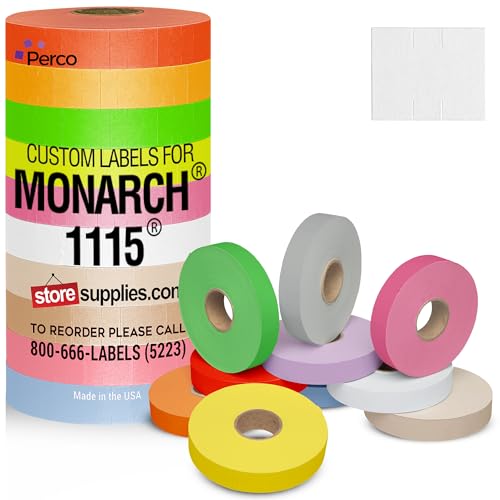
HOW IT WORKS: Once you place your custom order, we will email you with a digital label proof to make sure the labels are exactly how you want them. We will provide edits until you are happy with the design. Orders will not be sent for manufacturing until your label proof is approved.
The Importance of Combining Text and Color
When creating effective labels, combining both text and color can work wonders for understanding. This synergy boosts text-based organization and reveals a clear visual hierarchy. Color grabs attention—like a cat vying for your lap during a Zoom call—while text offers essential details. Together, they make complex information digestible and easy to remember.
Key benefits include:
- Simplified decision-making on product healthiness.
- Improved learning and retention through engaging visuals.
- Enhanced accessibility for all users.
Think of it like a friendly conversation—colors make it lively, and text tells the story. Relying solely on color might confuse some folks, so blending these elements is the ideal approach for effective labeling. After all, who doesn’t want clarity in a chaotic world?
Recommended Products

【12-Piece Outdoor Dining Set】This patio dining set contains 2 extended dining table, 2 armed dining chairs and 6 armless dining chairs. This HSPE outdoor dining set features aesthetic appeal that seamlessly blends with various outdoor settings, adding charm and elegance to your patio or garden, which is perfect for your family events.

[2-Person Glider Bench] Enjoy relaxing with your loved one on this spacious 2-person glider bench, measuring 26.97"W x 48.82"D x 35.24"H and capable of holding up to 660 pounds. The ergonomic design ensures a comfortable seating experience, perfect for unwinding in your outdoor space.

Cordova Java Dark Brown Frame w/ folding trays choose full or queen size and theres a choice to add drawer sets CHOICE TO ADD DRAWERS
Color Perception and Its Implications
Color plays an intriguing role in human experience, influencing everything from mood to memory. Color perception varies widely across individuals and cultures. Some people see red as a sign of love, while others might link it to anger—talk about mixed signals!
- Cultural variations shape how we perceive colors, despite some universal emotional associations.
- Individual differences, influenced by age or neurodiversity, can change how colors are viewed and felt.
Language has its say too. Just think! Different words for colors can affect our perceptions.
Understanding these nuances enhances our cognitive impact and visual perception. So next time you see a color, remember—it’s more than just a shade; it’s a vibrant part of human connection and experience!
User Preferences in Color Choice
Have you ever wondered why some people gravitate toward certain colors? User preferences in color choice are influenced by many factors, like cultural significance and emotional associations. For instance, red may symbolize luck in China but signify danger elsewhere. Additionally, age influences preferences—preschoolers often favor red and yellow, while adults may lean toward subtler hues.
Gender preferences play a role too; boys might choose green more often than girls, who prefer yellows and reds. Regional variations add another layer—colors loved in one country may fall flat in another, like a trendy outfit that makes sense one day and not the next. Ultimately, users find satisfaction and joy in colors that connect with their personal experiences and aesthetic appeal.
Strategies for Effective Organizational Systems
Effective organizational systems can transform chaos into harmony—think of them as a helpful guide through the clutter of daily life. To make this transformation, consider these strategies:
- Choose your color schemes wisely. Bright, contrasting colors can create a clear visual hierarchy, making important items pop.
- Be consistent. Use the same colors for similar tasks or categories. This consistency helps your brain recognize patterns quickly.
- Limit your palette. Too many colors can confuse. Stick to a few key shades that distinguish categories.
- Embrace labels. Pairing color coding with text labels provides clarity. Who doesn’t love a handy visual guide?
Implementing these strategies not only boosts organization but makes life—dare we say it—more colorful and enjoyable!
Recommended Products

CASE OF 30 SLEEVES VALUE PACK: Optimize efficiency with 30 sleeves containing 8 rolls each, with each roll having 1,000 vibrant labels—totaling an impressive 240,000 labels. Say goodbye to frequent replacements and keep your operations running seamlessly.

GENERAL-PURPOSE ADHESIVE: Designed for reliable sticking power on a variety of surfaces, including paper, plastic, and cardboard.

SERIES: Matches Safeguard 514 Alpha Label, SGAM Series, 1 each of 27 Rolls, 500/Roll, Alpha Letter, Complete Set A - Z, plus Mc, With Tray. This set is great as a starter set and Includes a tray for better organization.
Frequently Asked Questions
How Do Color Preferences Vary Across Different Cultures?
Color preferences differ across cultures, influenced by cultural symbolism and emotional responses. For instance, Western societies often favor blue for trust, while East Asian cultures may prefer softer hues like pink, reflecting varied aesthetic values and meanings.
What Are Common Color Combinations to Avoid in Organizational Systems?
Inaccessible colors, like red and green or blue and gray, muddle clarity in organizational systems. Instead, opting for complementary palettes enhances visibility, fostering a design that is both aesthetically pleasing and effectively communicative for all users.
How Can I Assess Color Effectiveness for My Specific Needs?
To assess color effectiveness for specific needs, one should analyze user feedback and study color psychology. This approach helps determine preferences, cognitive load impact, and retention improvements associated with various color-coding schemes in particular contexts.
Are There Universal Color Codes for Specific Industries or Tasks?
Yes, there are universal color code standards that apply to various industries. Specific tasks often utilize industry-specific colors to communicate hazards effectively, facilitating safer environments through consistent visual signals aligned with established regulations like OSHA and ANSI.
What Tools Can Help Me Create a Color-Coded System?
Various organization apps, including Notion and Trello, facilitate color picking for task management. These tools help create customizable color-coded systems, enhancing clarity, prioritization, and efficiency across different personal and professional projects for better organization.